Since the pandemic hit, the word “transformation” has started defining our lives. Everything from the way we work to the way we socialize has changed. And, undoubtedly, technology adjusted to the trend. Online fashion shows and movie festivals, music concerts inside computer games, the growth of NFTs — we now have a whole new “metaverse” reality. Finally, Facebook announced its rebranding into Meta to sum it all up.
At the same time, there’s still too much information to perceive, too much stuff to buy, and too many problems to worry about, which inspires minimalism, digital detoxes, and sustainability movements. Seems like life was so much simpler back then, which is why Netflix broadcasts retro-inspired shows, and influencers have rebirthed Y2K aesthetics.
But what does this have to do with color trends? In fact, everything: creative trends demonstrate social, technological, and cultural shifts. So, let’s try to figure out which global trends influence color choice in 2022, and how you can use them in business to be relevant.
1. Futuristic color palette
Transformation comes hand in hand with creativity. In fact, creativity, originality, and initiative are among the most valuable skills of the future. Moreover, technologies give us the freedom to express ourselves without leaving our homes. So, there are more and more electronic musicians, digital artists, YouTube bloggers, and Instagram or TikTok celebrities.
The creativity trend is so tangible nowadays that Pantone Color Institute devoted its color of the year choice to it. Very peri, a bluish-violet tint represents “the global zeitgeist of the moment and the transition we are going through”. It’s considered a color that inspires inventiveness and reflects the infusion of real and virtual worlds.
With trends in gaming, the expanding popularity of the metaverse and rising artistic community in the digital space Pantone 17-3938 Very Peri illustrates the fusion of modern life and how color trends in the digital world are being manifested in the physical world and vice versa.
Pantone Color Institute
How to use a futuristic color palette
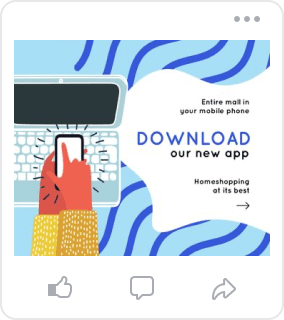
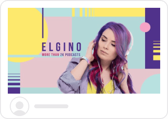
Very peri alongside neon shades, like purple, blue, and blue-green create a perfect palette for futuristic designs. Whether you’re launching a new app or developing a game, it works for the tech industry. You can also use these hues to promote your media on tech topics: podcasts, YouTube channels, etc. Besides, add neon colors to your Brand Kit to advertise digital art and electronic music festivals.
2. Y2K-inspired pastels and metallics
Remember the pink and fluffy 2000s with Paris Hilton as the leading lifestyle icon? Now, as Paris is back and Britney is free, the aesthetic of the early 2000s has taken over pop culture again. The explanation for this is that millennials and Gen-Z are nostalgic, and as they are the largest generations now, they define the trends.
The aesthetic got its name from the Y2K (“the year 2000”) problem. It refers to the computer system breakdown that was expected due to the switch from a two-digit year “99” to “00”.
Shiny metallic colors, pastel gradients, and holographic textures defined fashion, graphic design, movies, and music videos. In 2021, modern influencers, including Bella Hadid, Dua Lipa, and Hailey Bieber revived this aesthetic. In 2022, this trend is spreading even more.
How to use Y2K-inspired hues
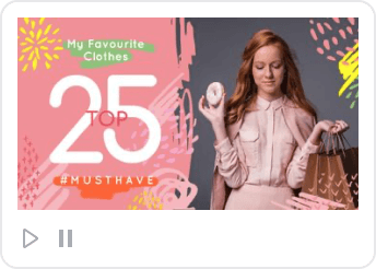
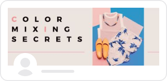
When talking about the Y2K-inspired aesthetic, there’s never too much pink. So don’t hesitate to use it and create up-to-date designs. Besides, use pastel colors like blue, yellow, green, and violet to create gradient backgrounds for your visuals. Also, you can consider different metallic tints, like silver, to create holographic texture.
The Y2K-inspired color palette is perfect if you’re selling clothes, footwear, or jewelry for a young audience. But you can also use these color techniques for other brands that target millennials and Gen-Z. Though, it might not be the best choice for food products, as it creates an artificial feeling.

3. Nature-related hues
Alongside technological breakthroughs, nature seems to need more attention from the world. The increasing talk about fast fashion, waste problems, and greenhouse gas emissions inspire “green” movements. Sustainability, garbage sorting, and organic product manufacturing are becoming more common, as we can no longer steer clear of the damage we cause to nature.
Another trend inspired by the pandemic was the reappraisal of urban living. More and more people are moving to rural regions to pursue more space. And a remote work format enables this.
Graphic design communicates what happens in the world, so no wonder natural hues are becoming popular. The most influential paint manufacturers chose earthy tints as colors of the year. Benjamin Moore went with october mist, a soft shade of green. Sherwin-Williams chose evergreen fog, a grey-green shade claimed to be a symbol of rebirth.
How to use a nature color palette
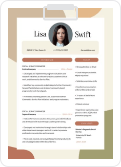
Other nature-related colors, which are forecasted to be a hit in 2022, are emerald green and different shades of brown. A nature-inspired color palette works for brands that sell food, beverages, and cosmetics, creating a natural brand image. It’s also an excellent choice for businesses focused on mental health.

4. Minimalism-inspired color choice
Although minimalism emerged in the 1960s as an art movement, modern society uses it as a lifestyle alternative to consumerism. As a result, minimalism has become a popular idea in recent years. In 2022 it’s still on the list of the top trends.
People strive to use things that serve a purpose, fight fast fashion by buying clothes in vintage stores, and unfollow influencers whose ideas they don’t share. Minimalism is not only about buying less; it’s about a more focused and meaningful lifestyle. So it touches upon everything from the content you consume when scrolling Instagram, to the product you eat for breakfast.
How to use minimalism-inspired palettes
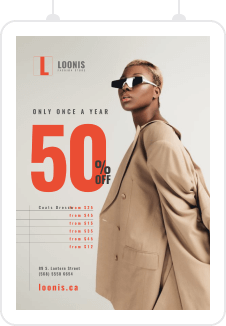
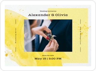
In design, minimalism is about light colors, simple forms, and many plain backgrounds. A perfect palette to create a minimalistic brand identity includes pale shades of white, grey, blue, and green, like dark grey or basil, for example. This aesthetic works for cosmetic, ceramics, home decor, or jewelry brands. It’s also perfect if you’re working with finances.

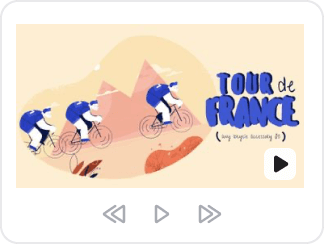
But minimalism shouldn’t necessarily be pale and calm. You can also experiment with a primary color palette (red, yellow, blue) inspired by Bauhaus. This German art school was famous for combining aesthetics and function. Bauhaus-inspired design principles can help you preserve design consistency, as a primary color palette is never out of fashion.

5. Psychedelic color scheme
Pop culture often refers to retro stylistics: think of Netflix’s “Stranger things” or “Sex education” series. While 80s nostalgia is still influencing design in 2022, this year’s primary trend will be psychedelic art from the 70s.
This could be due to the liberation of psychedelic therapy for mental health care, or the desire to experiment in digital design. Anyway, get ready for surreal images, vibrant colors, kaleidoscopical patterns, as you’re going to be seeing a lot of them in 2022.
Psychedelic art started with San Francisco poster artists Rick Griffin, Victor Moscoso, Bonnie MacLean, and others. They created designs for favorite music bands like Jefferson Airplane, Grateful Dead, and Jimi Hendrix. Later, it went beyond the music scene and became a full-fledged art movement.
How to use psychedelic colors in designs
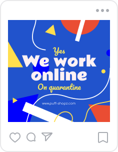
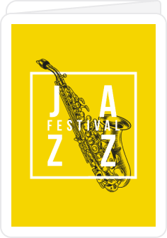
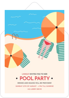
Use a bright color palette, including yellow, neon green, magenta, and cyan, to revive the psychedelic aesthetic in your designs. This style is perfect for artists and musicians, as it’s considered artistic and bold. You can also use this color scheme to stand out and grab your audience’s attention, mainly if you target young people.

Color trends in a nutshell
2022 can be a year of experiments and bold color solutions with Y2K-inspired, metaverse-related, or psychedelic aesthetics. But it can also become a year of unity with nature and minimalism. It’s up to you what trend to follow; just try to match your palette choices with your business identity.
If you’re still learning about colors, the meanings behind them, and the feelings they evoke, visit the VistaCreate Colors page. Here, you can explore well-balanced color palettes created by professional designers for different purposes and brands. So, channel your creativity in 2022 and conquer your audience with trendy designs.

